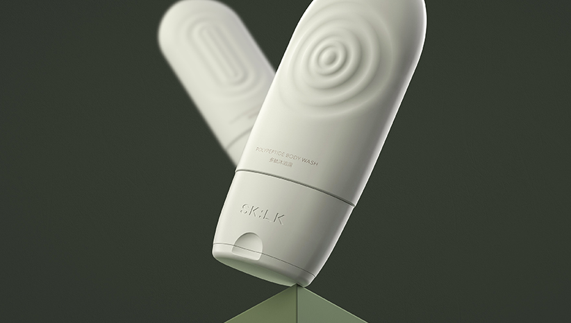
This series of products are closer to medical skincare products, so we build a product image that is overall safer and more professional. The overall tone is black, white and grey; and the black double arrows are combined to form a cross, making the design closer to the thematic concept–medicine, first aid, repair.